After a year like 2020, most of us could use some uplifting and some grounding. Pantone is ushering in the New Year with two colors that emanate emotions both calm and bright. While Ultimate Gray and Illuminating are not shades we frequently utilize, we’ve gathered some visual ways to make these colors (or similar hues) livable from our past projects.
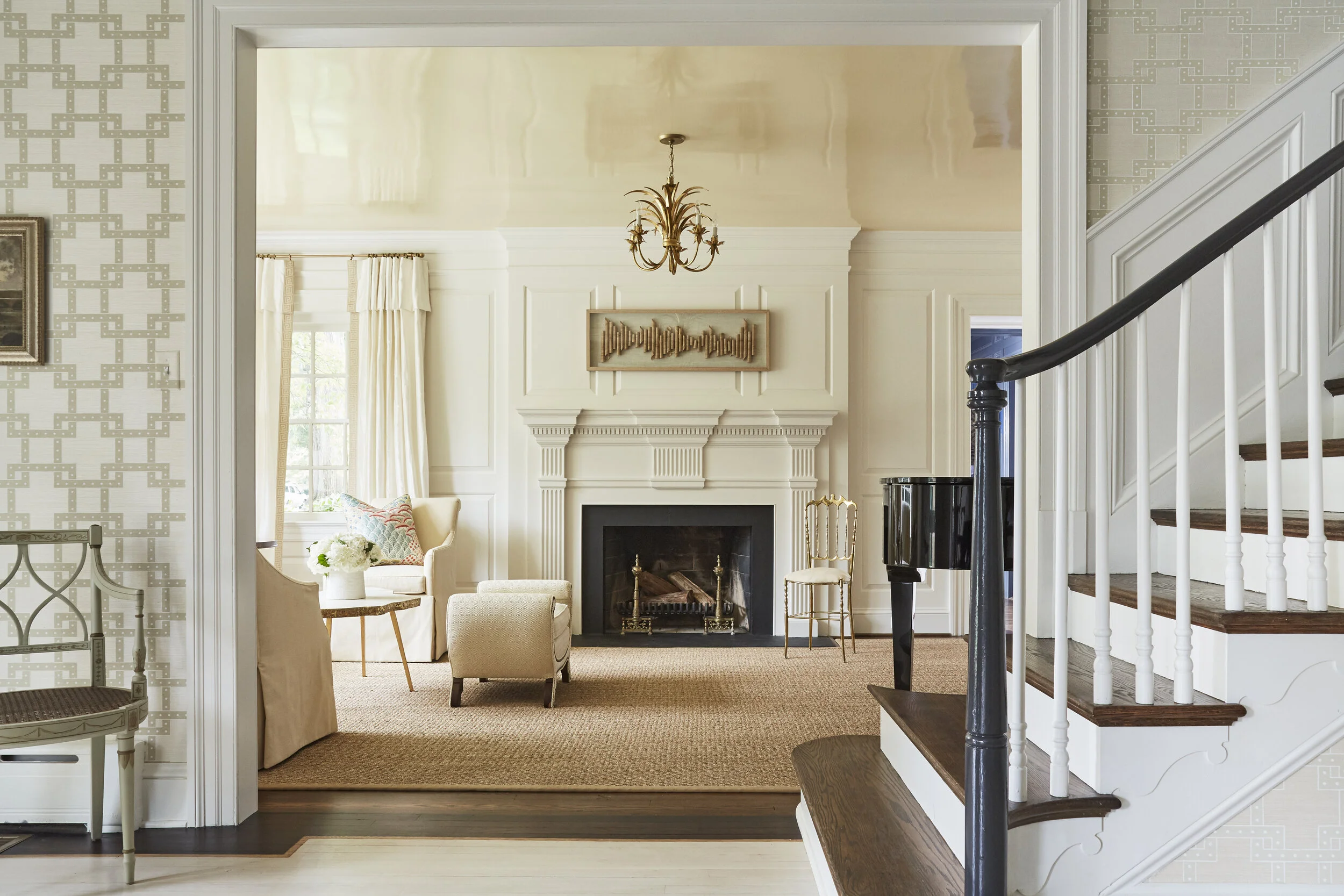
Incorporating a shiny golden-hued ceiling is a little like living just a bit closer to the sun. We used warm shades of yellow throughout this room along with gold accents and creams (and even a honey-hued seagrass rug) to keep it light and bright.
Just a pop of this yellow is enough to transform a room. The bone-colored busts of composers, earned from participating in piano recitals and a nod to the family’s avid interest in music) pop, especially when situated within a contrasting black frame.
Sunny yellow and gold unite the furniture, artwork, and accessories in this sitting area, while the subtle differences in shades add texture and vibrancy. The two-toned sofa is a modern, refreshing choice.
Incorporating calming “greige” roman shades might seem like a minor style decision, but they offer just enough contrast to the white carpet and walls to help create a soothing transition for the eye.
We love all the earth and jewel tones in our client’s beautiful collection of pottery and vases. Selecting sunny yet subtle yellow chairs with matching chevron pillows helps to lift the space while also drawing attention to the variety of pieces on display.
Pantone describes the color duo as a “marriage conveying a message of strength and hopefulness that is both enduring and uplifting”, and we hope you begin 2021 harnessing that fortifying, uplifting energy in your homes and in your lives.
FOLLOW US ON INSTAGRAM @sarahilleryinteriordesign
Gallery Block
This is an example. To display your Instagram posts, double-click here to add an account or select an existing connected account.
Learn more