Gallery walls are one of the most striking ways to decorate and unify a room. This popular layout is also an ingenious way to make use of a collection of postcards from around the world that you currently have stuffed into a desk drawer, to create a photographic homage to friends and family, or to display multiple pieces of art from diverse media without using up maximum wall space.
To keep gallery walls looking organized and eye-catching, we have a few simple rules. Following these guidelines will keep your gallery wall from looking haphazard and thrown together, yet they still leave plenty of room to get creative and celebrate your space.
*Find ways to make different things come together through framing and matting.
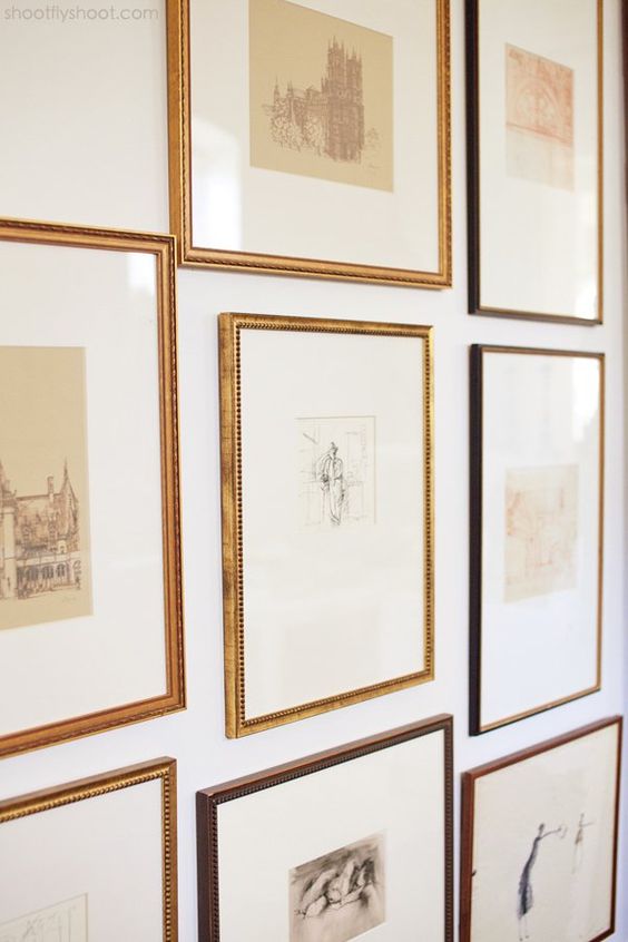
If you are combining varied types of art, media, or material, using similar frames is a wonderful way to keep a cohesive “look” to the gallery wall. Even on a large wall, we don’t suggest using more than five types of frames.
Using a large matte in one color also helps to create a serene, collected feel even when the individual pieces vary greatly in size.

Of course, rules are made to be broken-occasionally. In the Designer House kitchen we created, the color pink served as a dominant and unifying common thread throughout the gallery wall. We framed some of the pieces and left others “floating”; the frames became secondary to the colorful art since the eye is drawn first and foremost to the vibrant, flirty color.


*Work your design layout from the outside in.
It can be helpful to decide on a defined shape to serve as an outline for the gallery wall and then choose your art to fit within that space. Containing the art creates order to the wall’s design, while simultaneously allowing you to be slightly more flexible with spacing. For example, this stairway gallery wall uses virtually no spacing between the frames, forming a tightly constructed shape that draws viewers in for closer examination.
To keep a more freeform gallery wall from appearing chaotic, however, use equal spacing between the pieces for a calming, organized appearance.
*Follow the rule of 3.
Selecting three main colors or types of frames greatly contributes to a unified look. The bold yet elegant gallery wall focuses on white, black, and gold for a sleek, high-contrast ambiance. Alternating the frames in gold and black keep the wall from appearing too matchy-matchy, while still appearing curated.

This rule of three can also be expanded to five colors and display options, as in this Texas home. Matted and matte-free black and white photographs mingle with color images and are carefully spaced to allow visitors (and the family members themselves) relive and celebrate important and cherished moments in their history.


*Think outside the images and focusing on frames to create visual variety.
Frames can add color and texture to a wall that is otherwise devoted primarily to one color. The black-and-white art selections on this gallery wall include photographs, paintings, and geometric-based drawings. Despite being set against a stark white wall, the art stands out as a result of simple, yet contrasting frames in black, white, and natural wood. The textured frame at the wall’s center draws the focus in and then gently encourages the eye to move along.
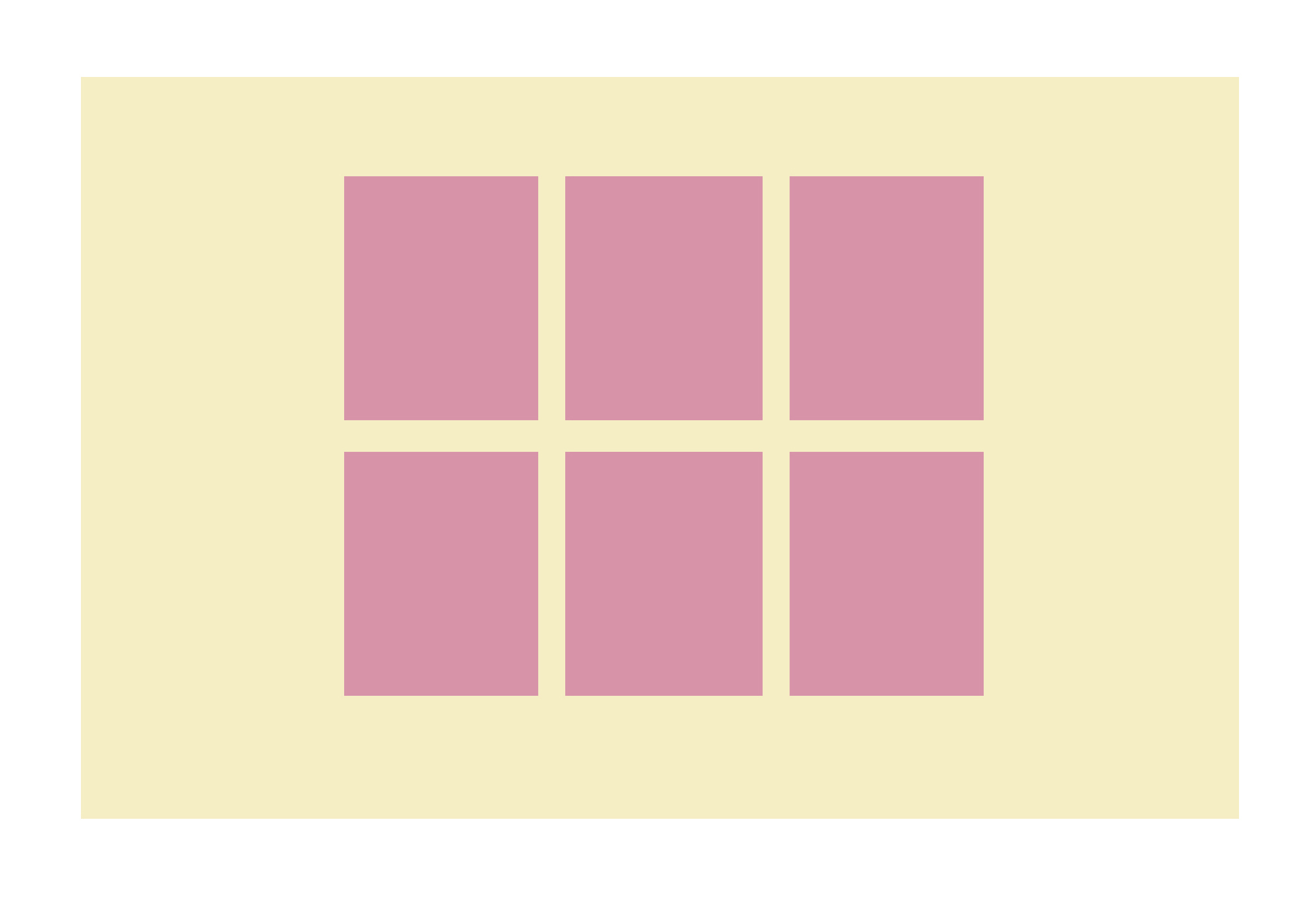
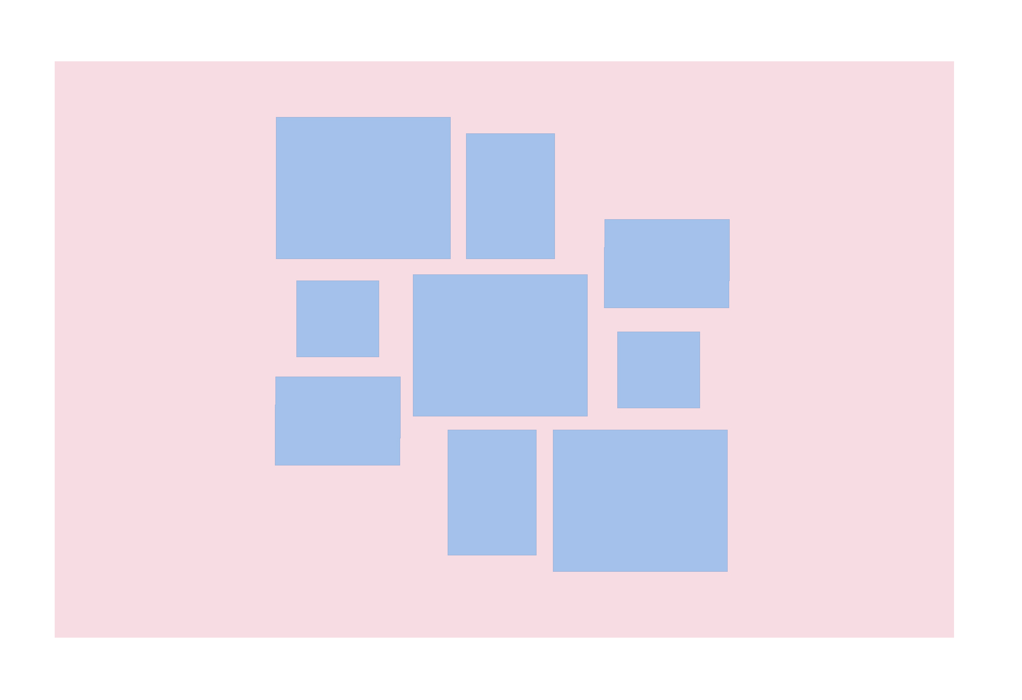
We’ve included some sample gallery wall layouts to use as your guide. As collectors and designers, we adore how gallery walls allow you to showcase some of your favorites items and works of art together-there’s nothing better than being surrounded by all the different things that you love the most and that you have collected along the journey to your current home.