Another school year in the books! Whether your kids’ summer schedules require several outfit and accessory changes (camp to swim practice to softball games to sleepover days, we are looking at you!) or you have children that can’t wait to sleep late(r) and relax, having kids around and off their regular schedule means that our homes can quickly look like tornadoes have passed through.
While you might not be able to do away completely with kid chaos, your family spaces can still feel collected and sophisticated by using smart materials, thoughtful storage, and intentional design.
Here are 5 tips for maintaining sanity and serenity during the busy summer months.
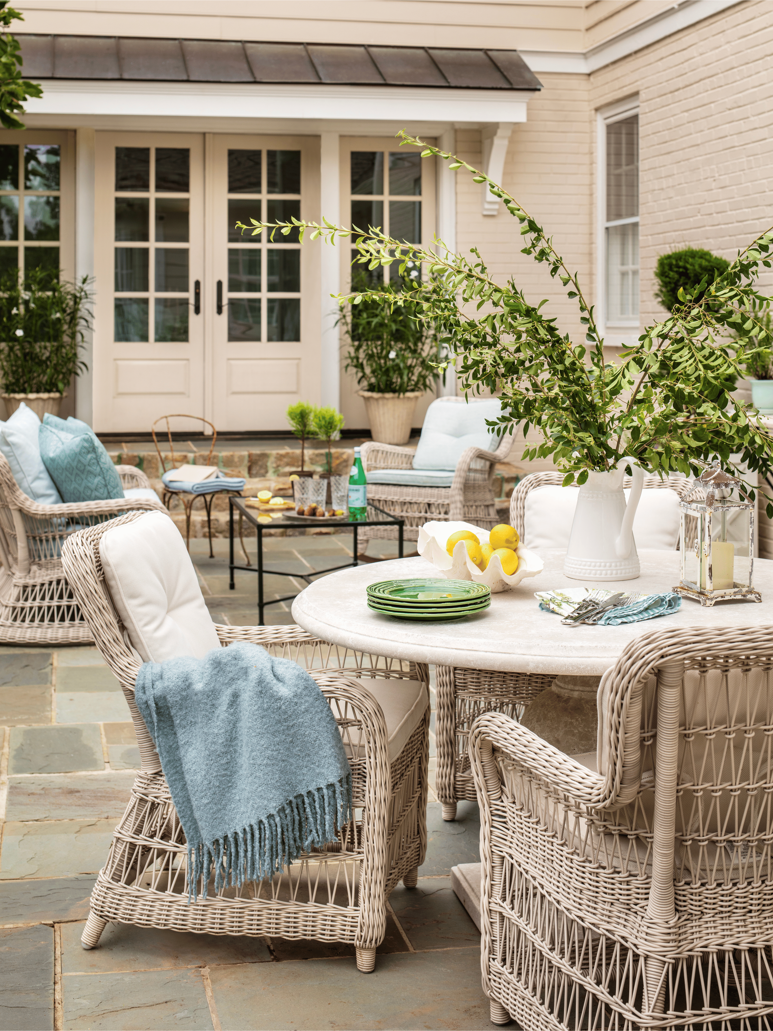
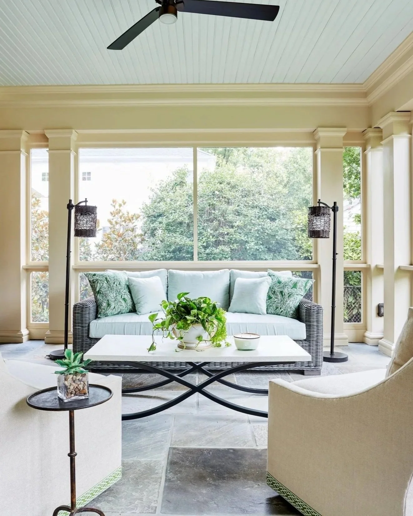
Use performance fabrics and durable materials.
We recommend that EVERY family with kids or pets use performance fabrics without shame or style fears. Designs have evolved over the years, and you no longer have to sacrifice style in order to have fabrics that can withstand lots of traffic and use.
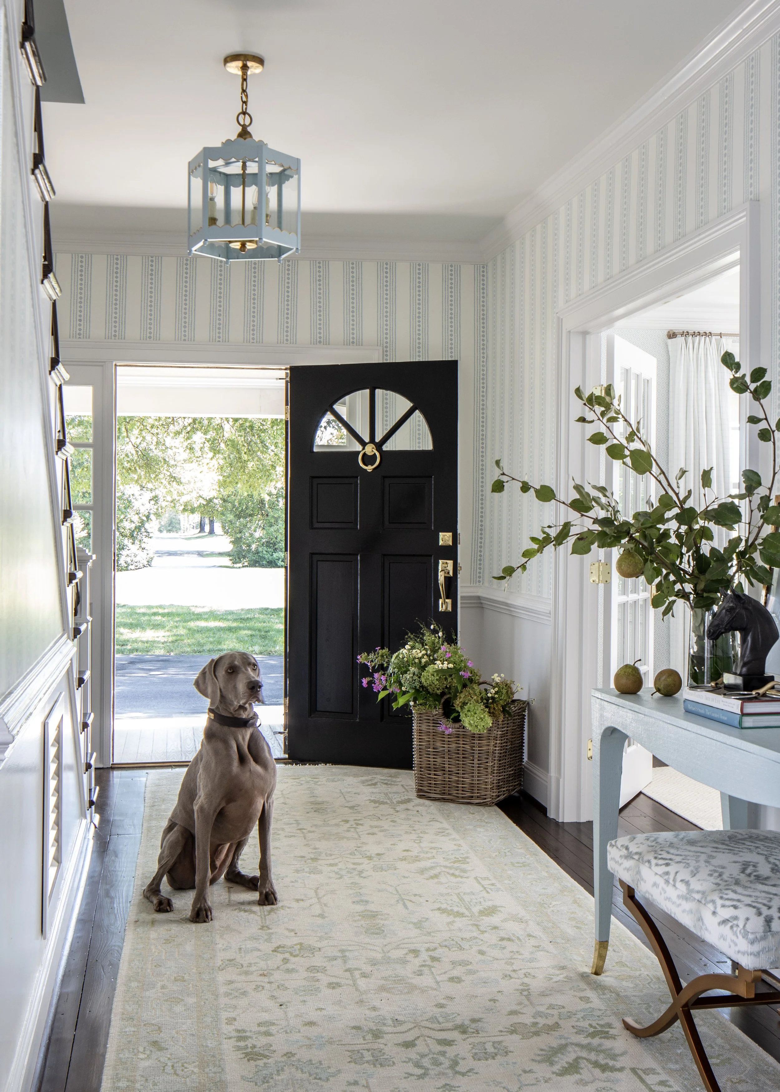
Other ways to make your life easier: use washable rugs, durable textiles, and materials that age gracefully with family life (think natural materials like woods that can weather scuffs as opposed to plastics that chip or get easily dinged).
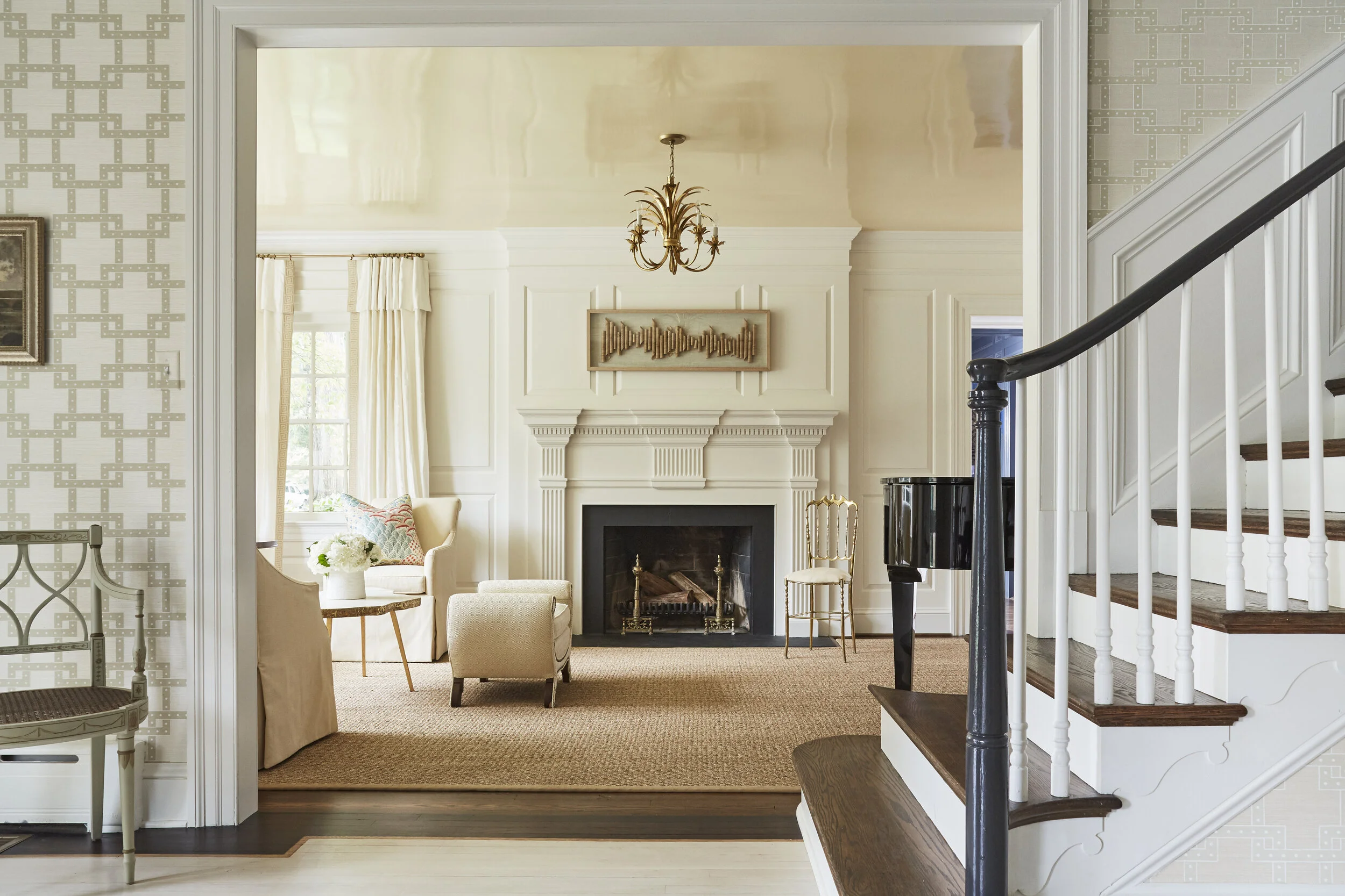
An all-season tip: use a satin paint finish for high-traffic areas.
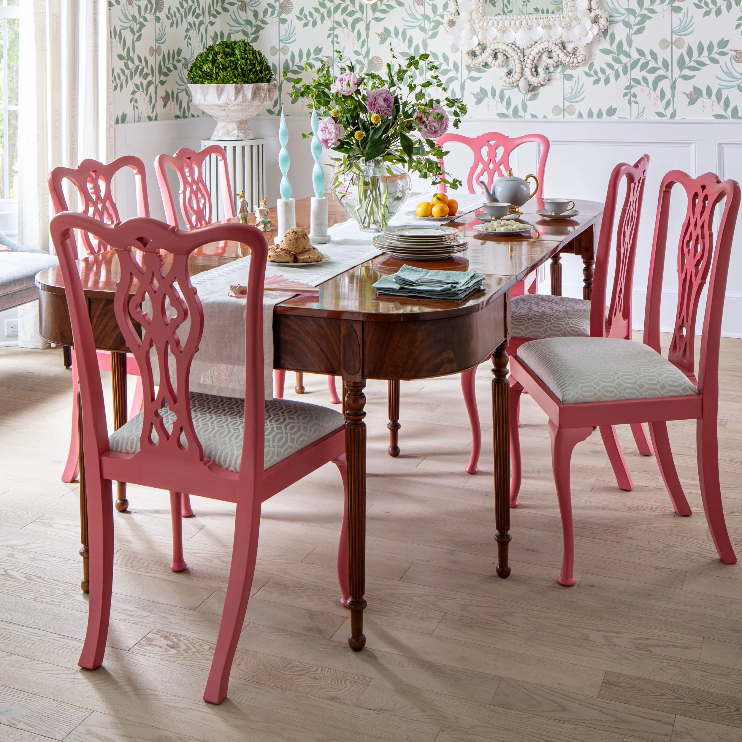
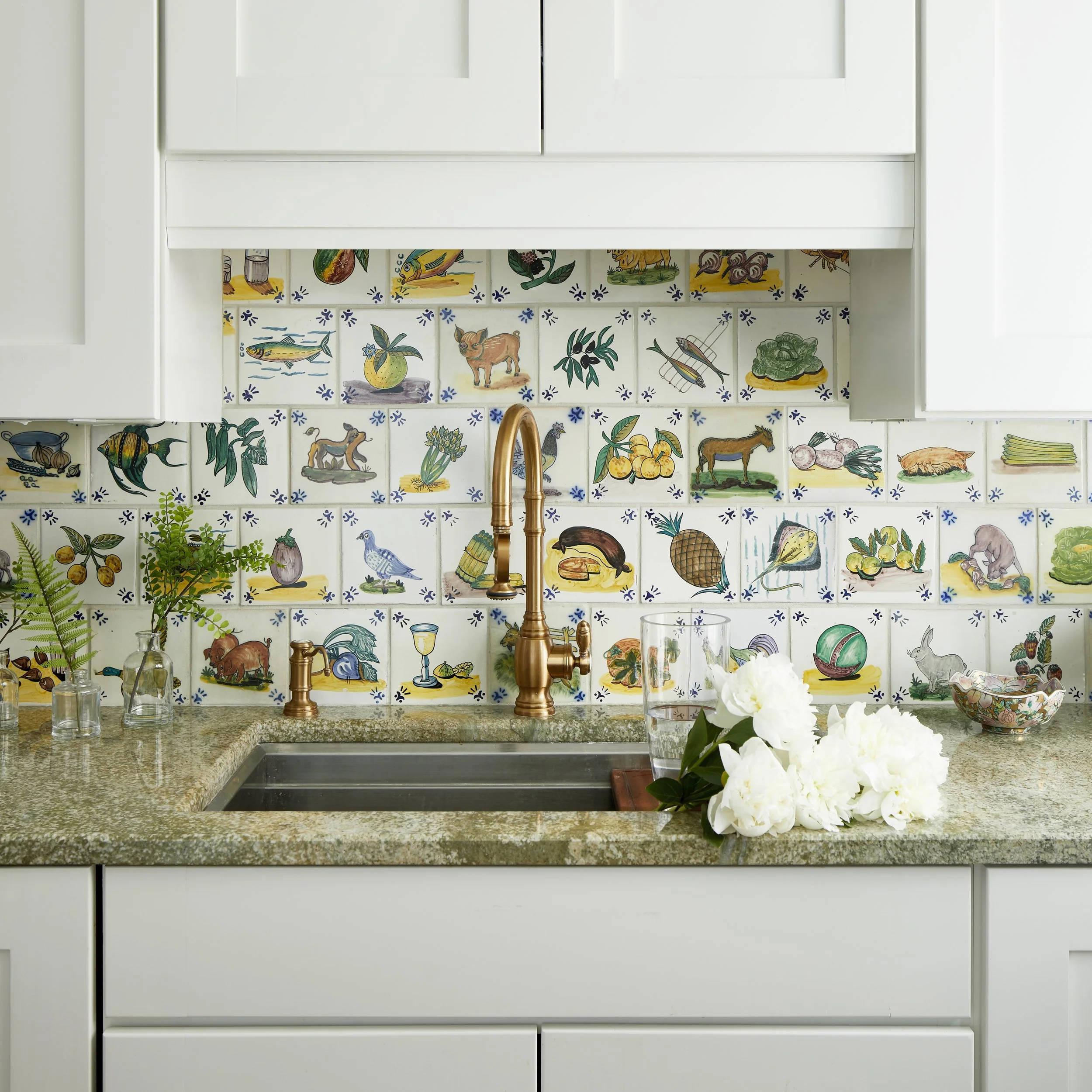
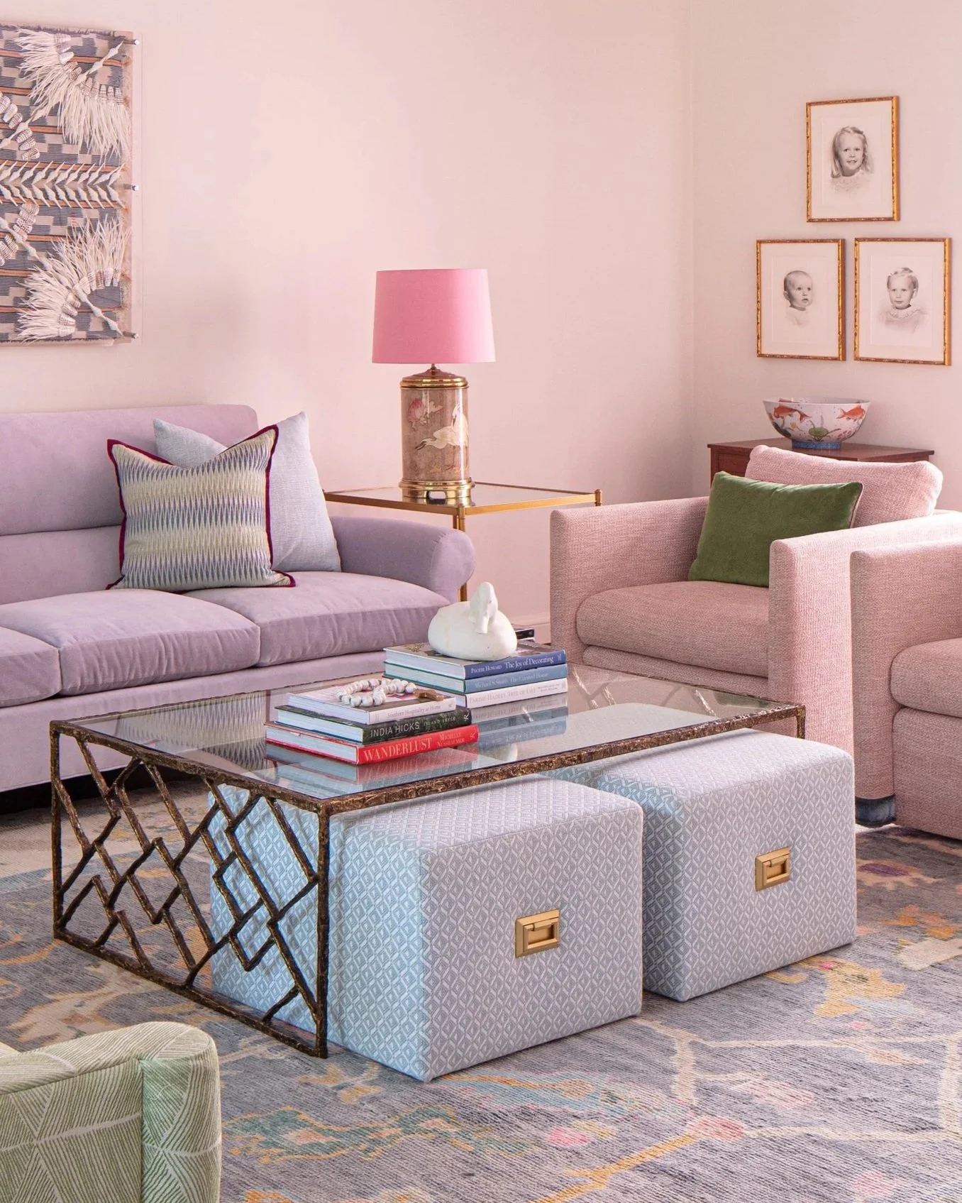
Incorporate pattern as protection
Monochromatic, minimalist design is sleek, serene, and typically NOT the best option for families with young children. Instead, lean into pattern play, and you’ll be pleasantly surprised by how much less stressed you’ll be if someone drops a freshly made PB&J onto the couch (not that we are speaking from personal experience).
Patterns keep the eyes busy and hide all manner of sins so choosing rugs, wallpaper, and furniture upholstered in prints is a functional choice as well as an aesthetic one. Today you can find repeating patterns of everything from florals to types of transportation to animals and in styles that are bold or subtle, so you can let your little ones help choose. Pro tip: if they are in on the decisions, they will likely be just a bit more careful!
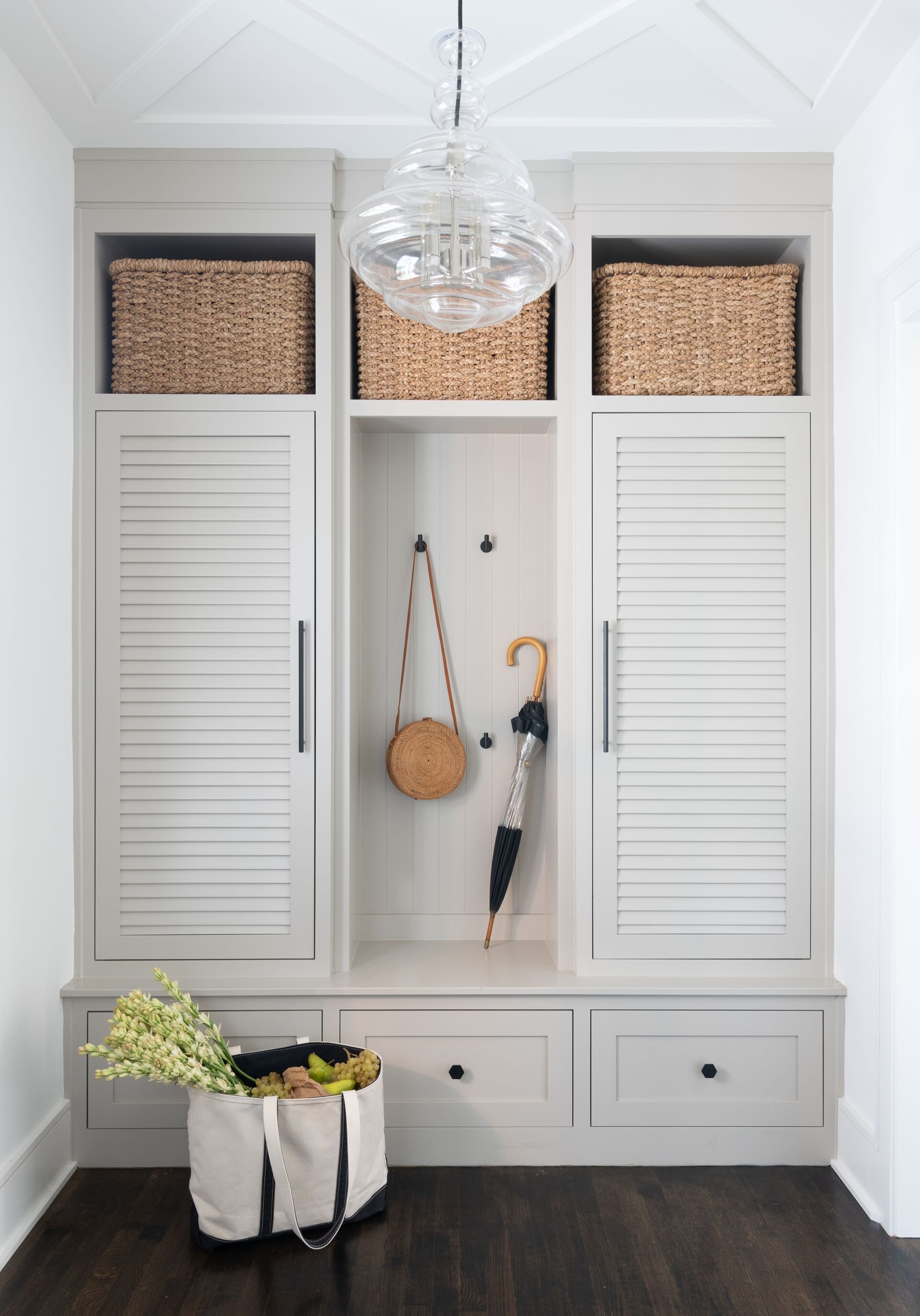
Use closed storage to keep things contained (and away from your eyes).
Even if you can’t eliminate the clutter, you CAN contain it with cabinets, built-ins, and antique armoires. Level up the interiors of these storage areas with labeled baskets and other organizational systems that keep everyday items accessible but out of sight.
The best system? The one that works for you and your family and is age appropriate. Even the smallest kids can learn that dolls go in the blue bin and race cars live in the orange one. You’ll be amazed at how much clearer and cleaner your home will look simply by closing a door.
Keep safety measures top of mind.
When it’s too hot or too rainy to play outside or when it’s your turn to host a marathon playdate, kids become a little like caged animals and furniture quickly starts looking a lot like an indoor climbing gym or obstacle course.
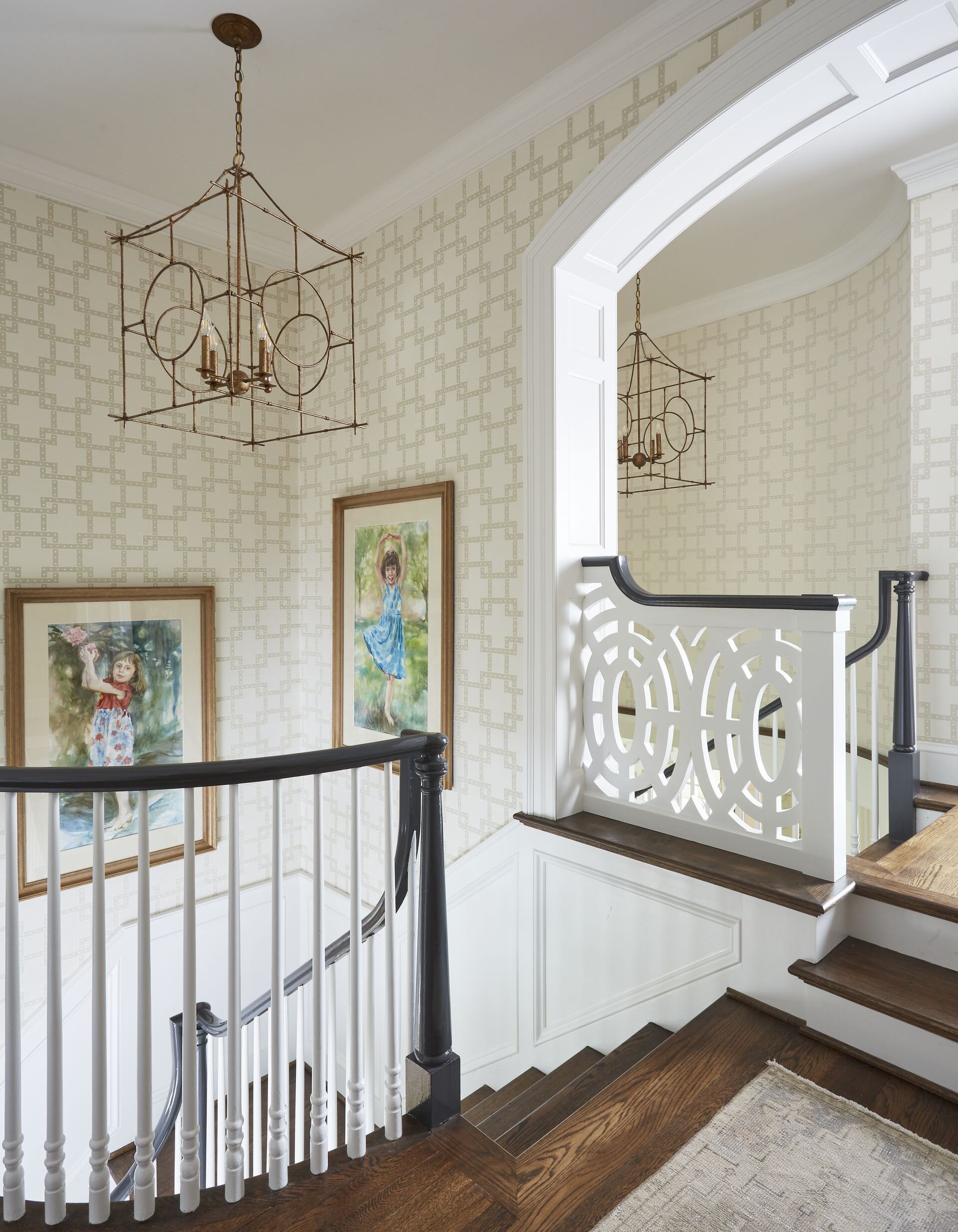
It’s always a good idea, no matter what age family members are, to secure heavy furniture and shelving. For little ones, selecting pieces with rounded edges and having a carpet or a rug that will offer a softer landing will give you peace of mind (and that extra layer may also dampen noise a bit as well).
Having a perfectly tidy house during the summer may not be realistic, but having kid-friendly spaces, furniture and fabrics that can take the heat, and quick options for stowing toys and clutter will help you embrace and enjoy the season!

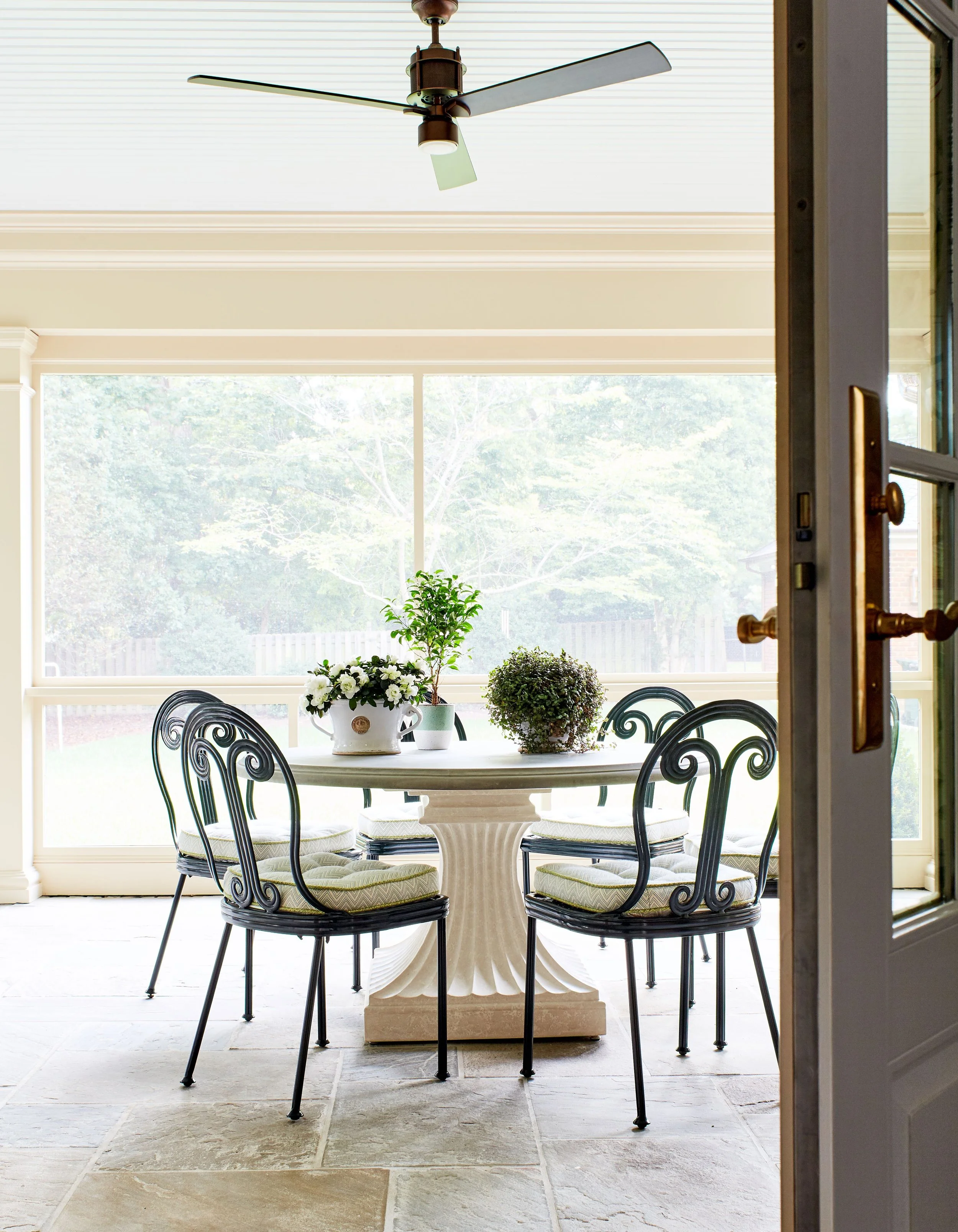
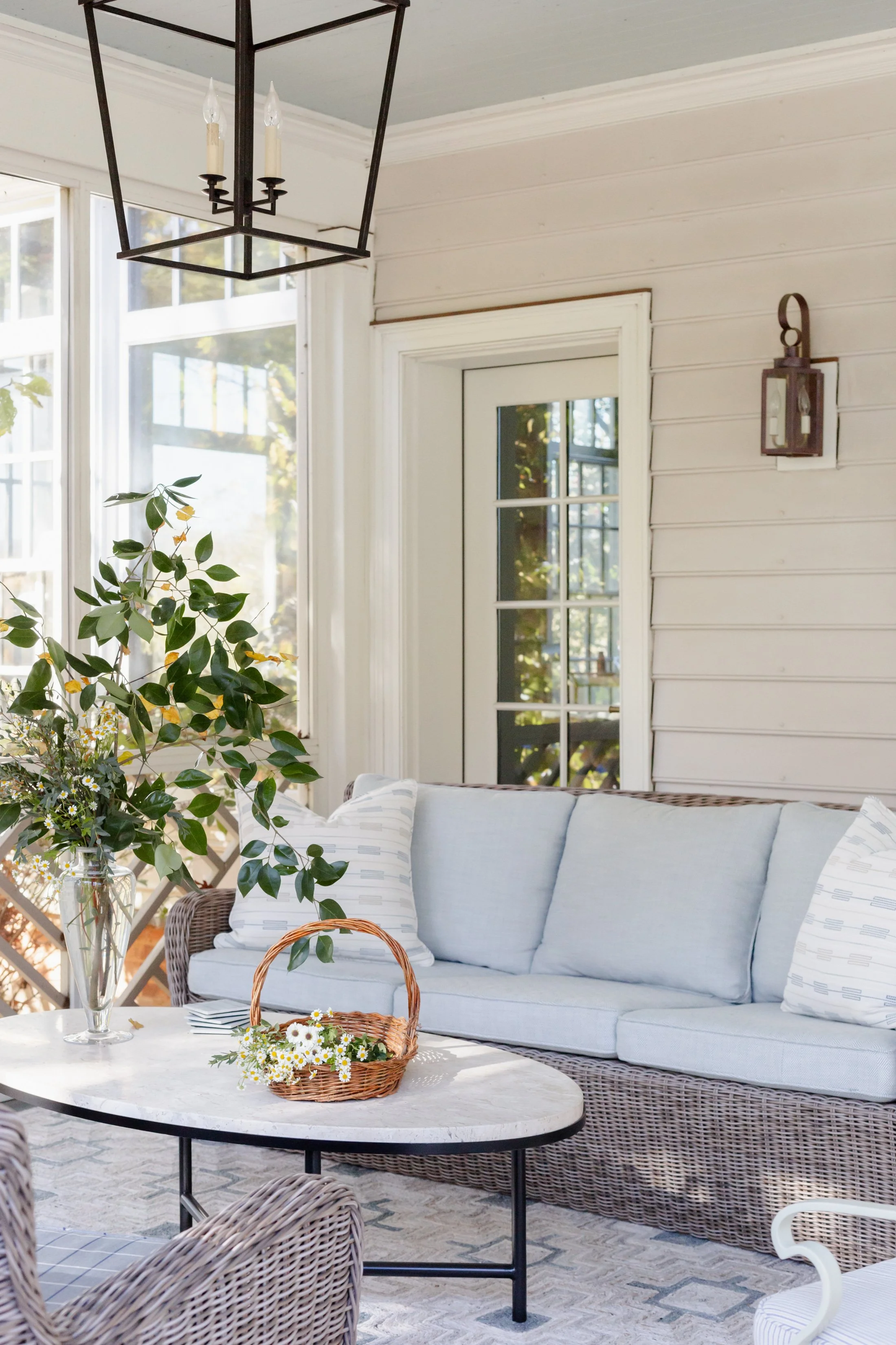
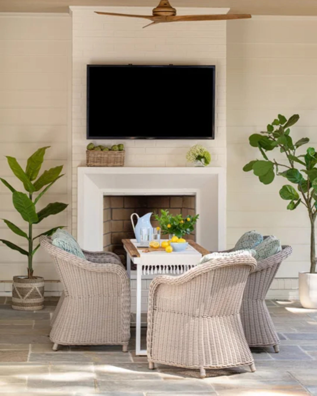
How can you create a beautiful and functional outdoor living space? Sara Hillery Interior Design shares patio design ideas for entertaining, outdoor furniture selection, performance fabrics, lighting, and creating comfortable spaces that connect with nature.